Radio-Canada Typeface
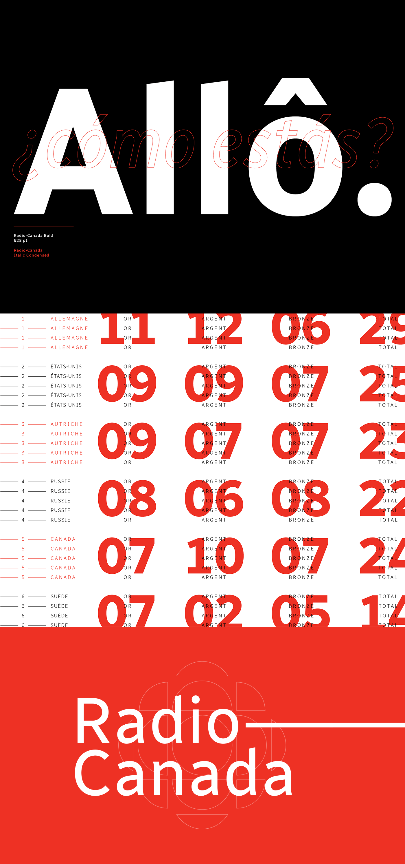
La Société Radio-Canada (SRC) est une société de la Couronne canadienne et le plus ancien service de diffusion francophone du Canada. Au début de l’année 2017, j’ai été mandaté par la société d’État afin de créer une police de caractères contemporaine et polyvalente qui sera déployée à travers ses plateformes numériques (Web, broadcast, apps, etc.).
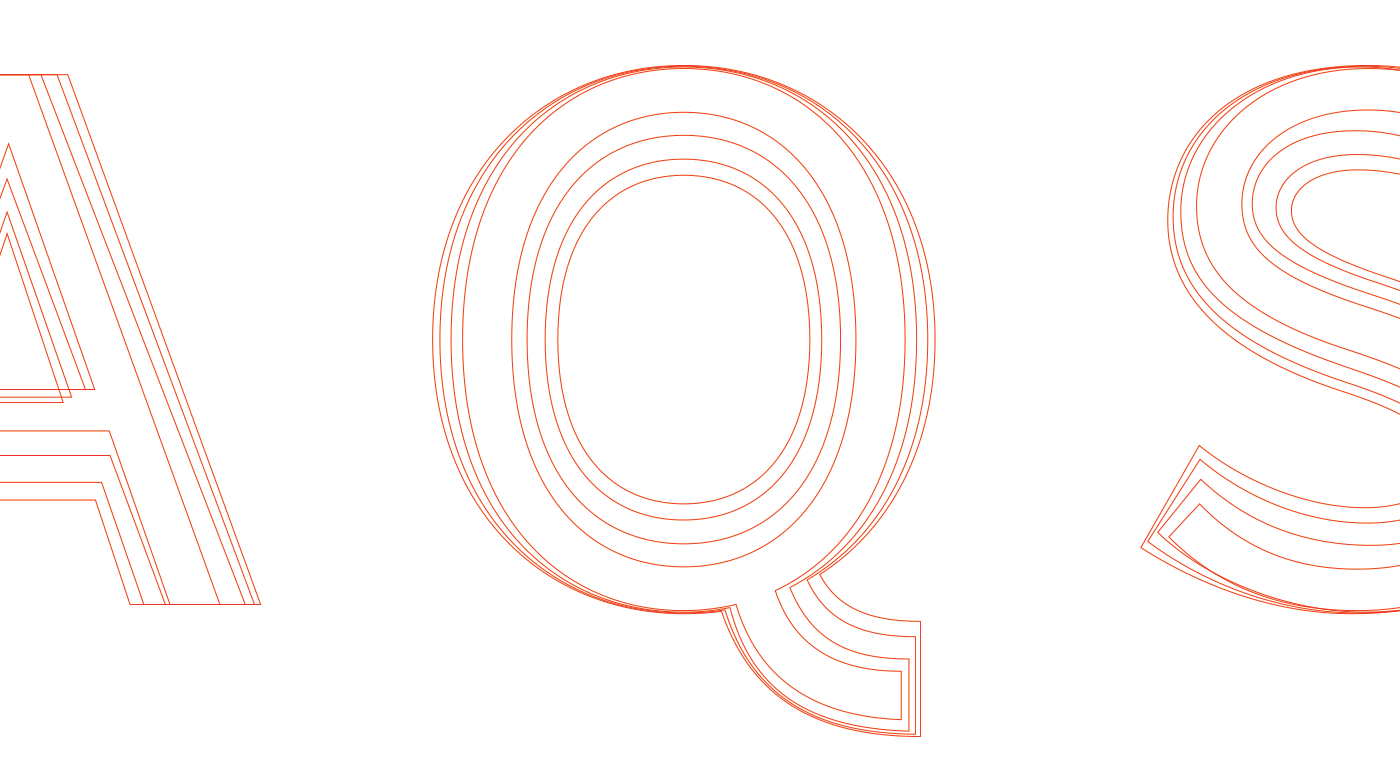
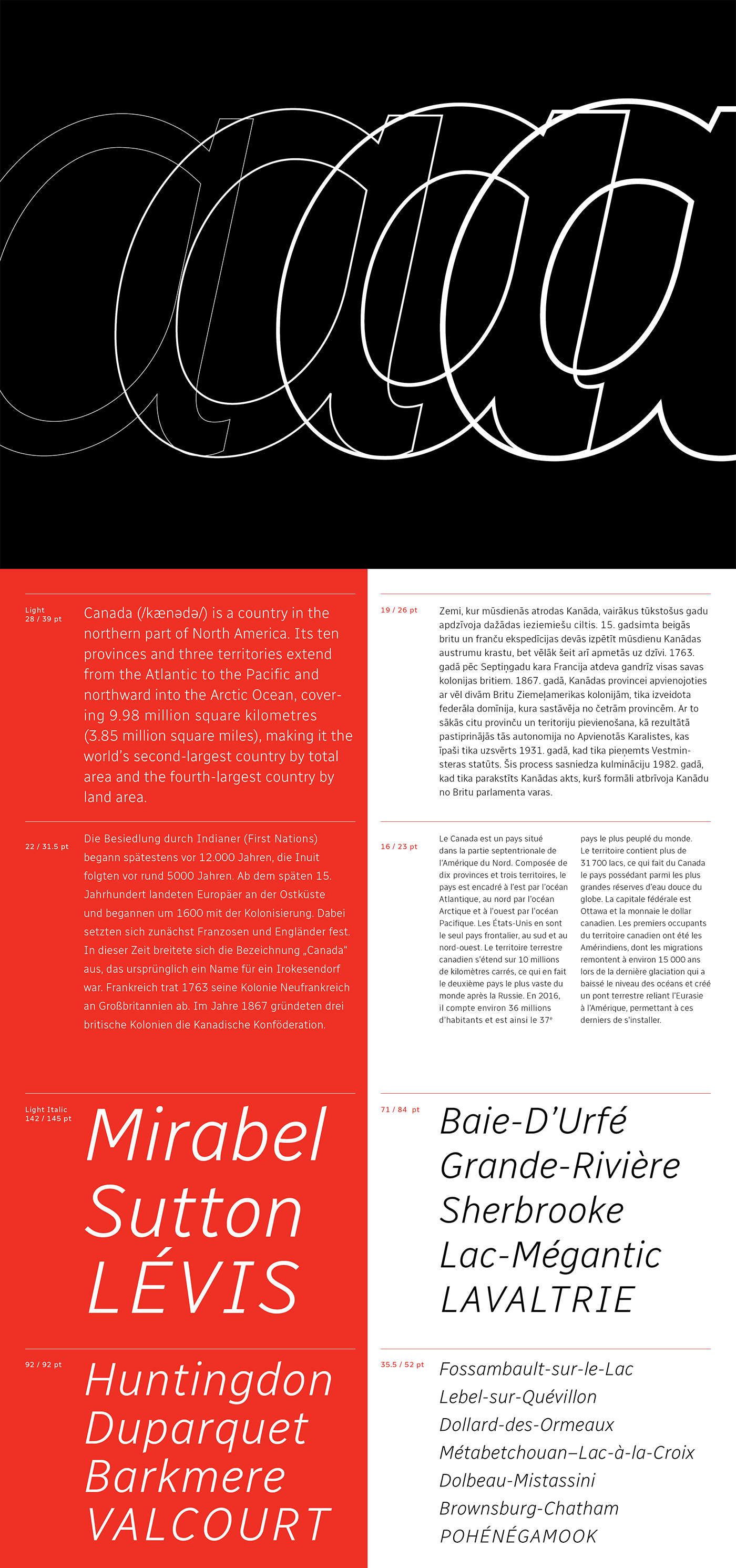
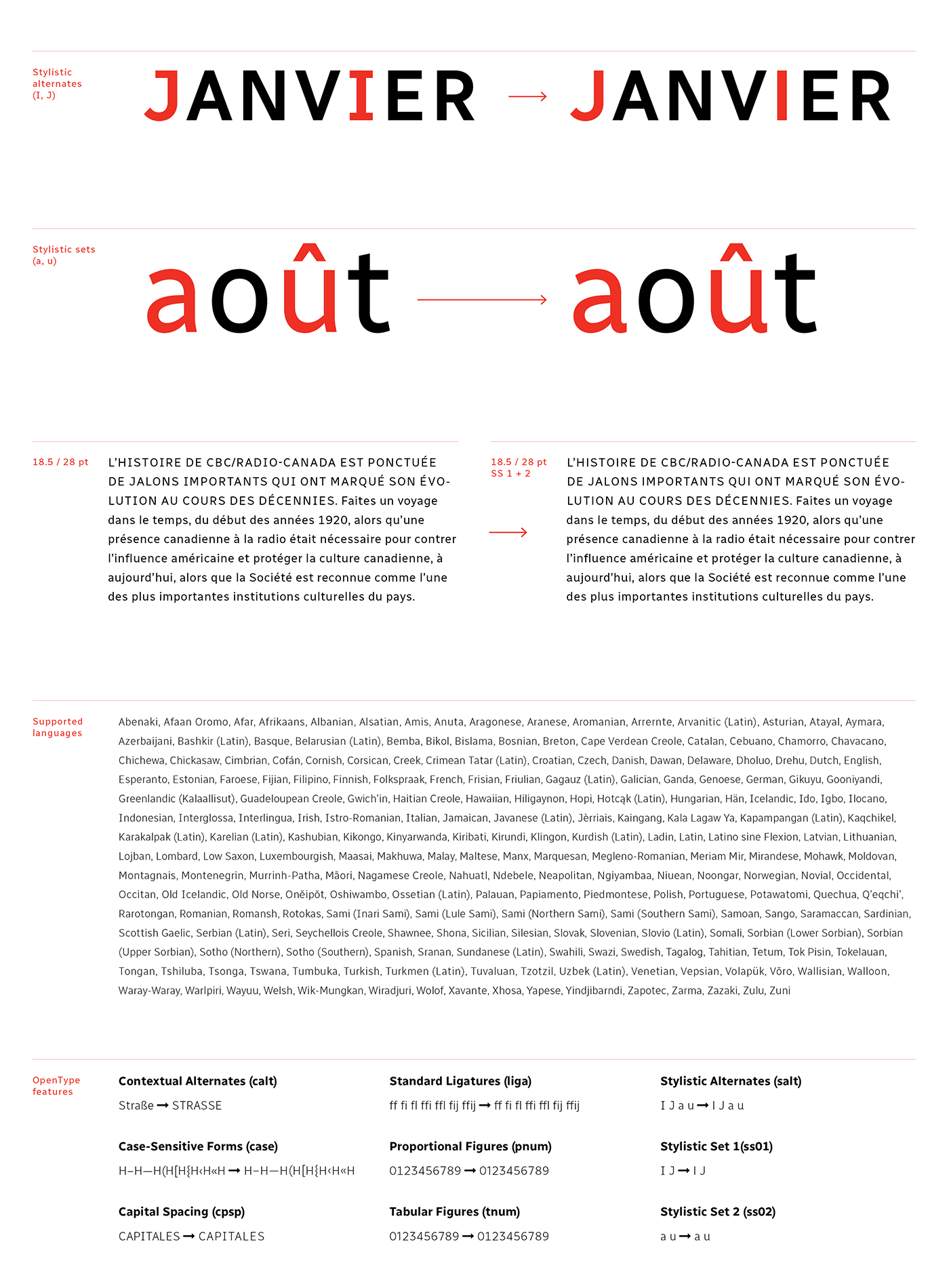
Avec la collaboration d'Étienne Aubert Bonne de chez Coppers and Brasses et du typographe Alexandre Saumier Demers, nous avons créé une police humaniste conçue spécifiquement pour offrir une lisibilité optimale. Elle se démarque dans de subtils détails, comme des caractères ascendants (b, d) et descendants (p, q) anglés, ou encore des empattements distinctifs (I, J).
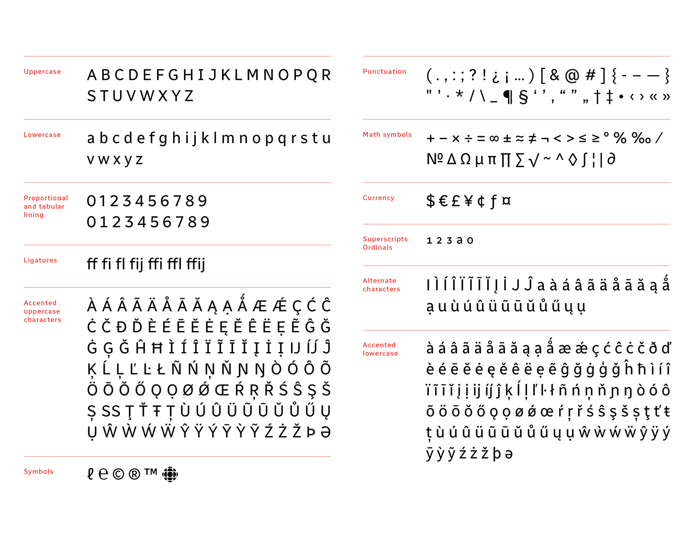
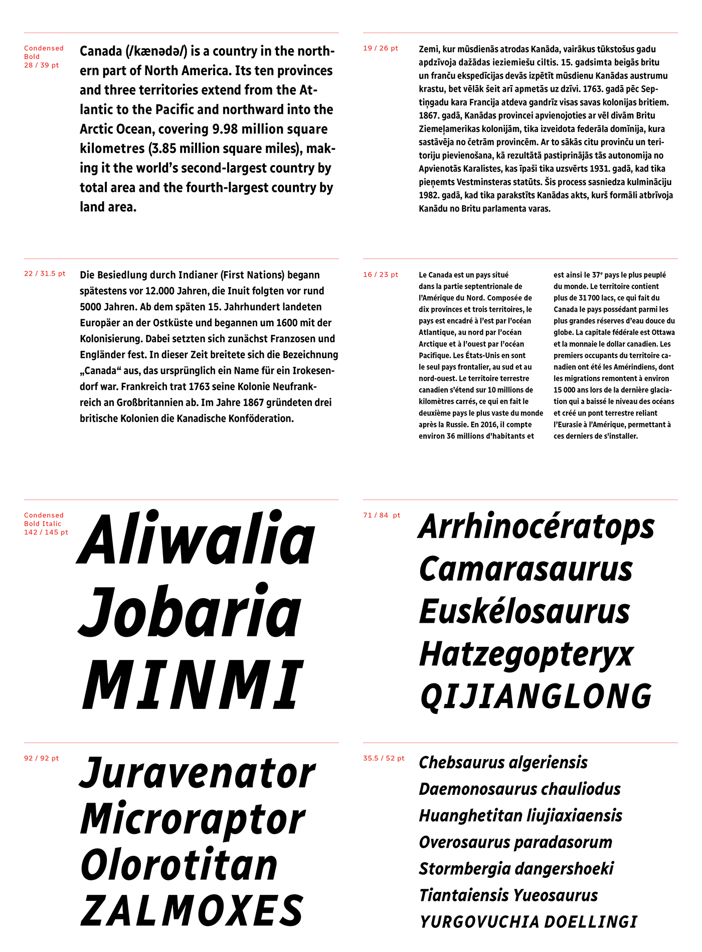
Sa hauteur d’x assure une excellente lisibilité, tout en respectant les normes d’accessibilité. Son jeu de caractères complet prend en charge plus de 200 langues. On y retrouve également plusieurs fonctionnalités OpenType telles que des chiffres proportionnels et tabulaires ainsi qu’un jeu de style supplémentaire (I, J, a, u).
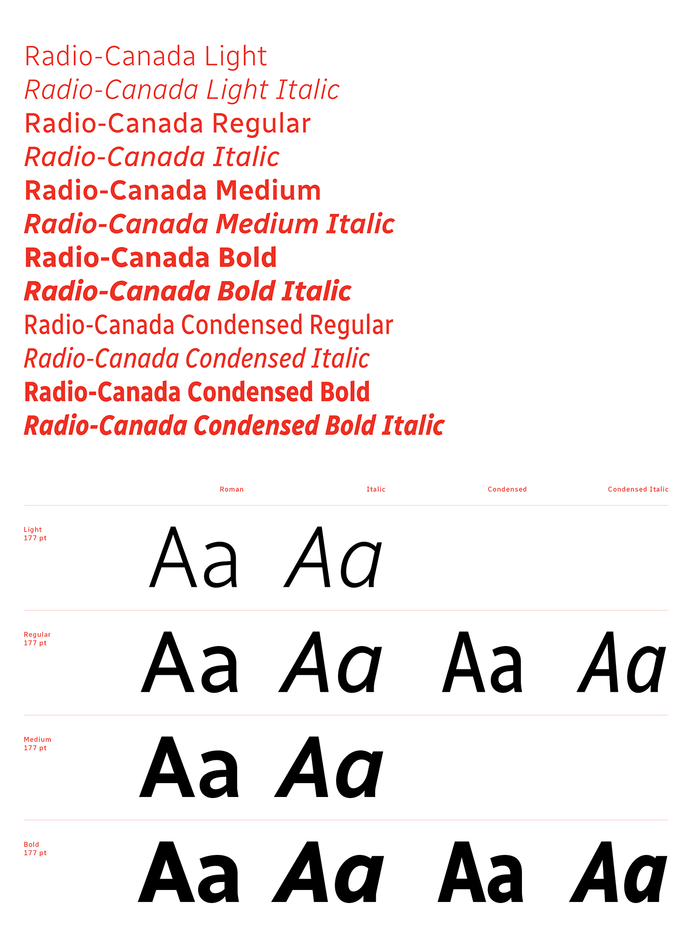
La police Radio-Canada est disponible dans les styles suivants : Light, Light Italic, Regular, Italic, Medium, Medium Italic, Bold, Bold Italic, Condensed Regular, Condensed Italic, Condensed Bold et Condensed Bold Italic.
Ce projet figure parmi les projets gagnants dans la catégorie « Typeface Design » à la compétition 2018 des Communication Arts.
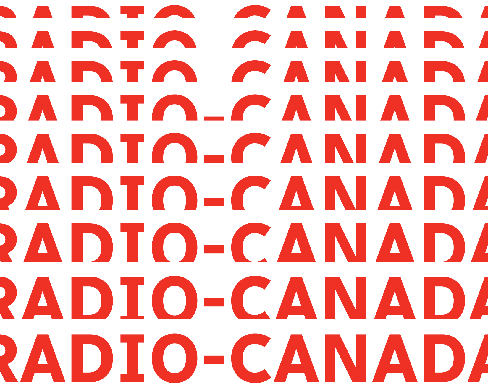
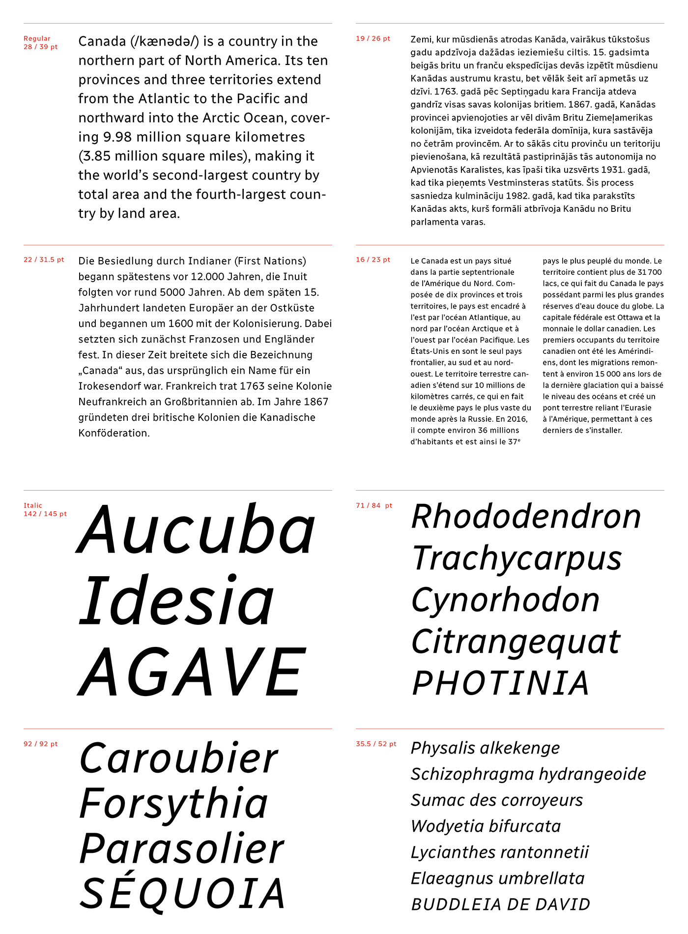
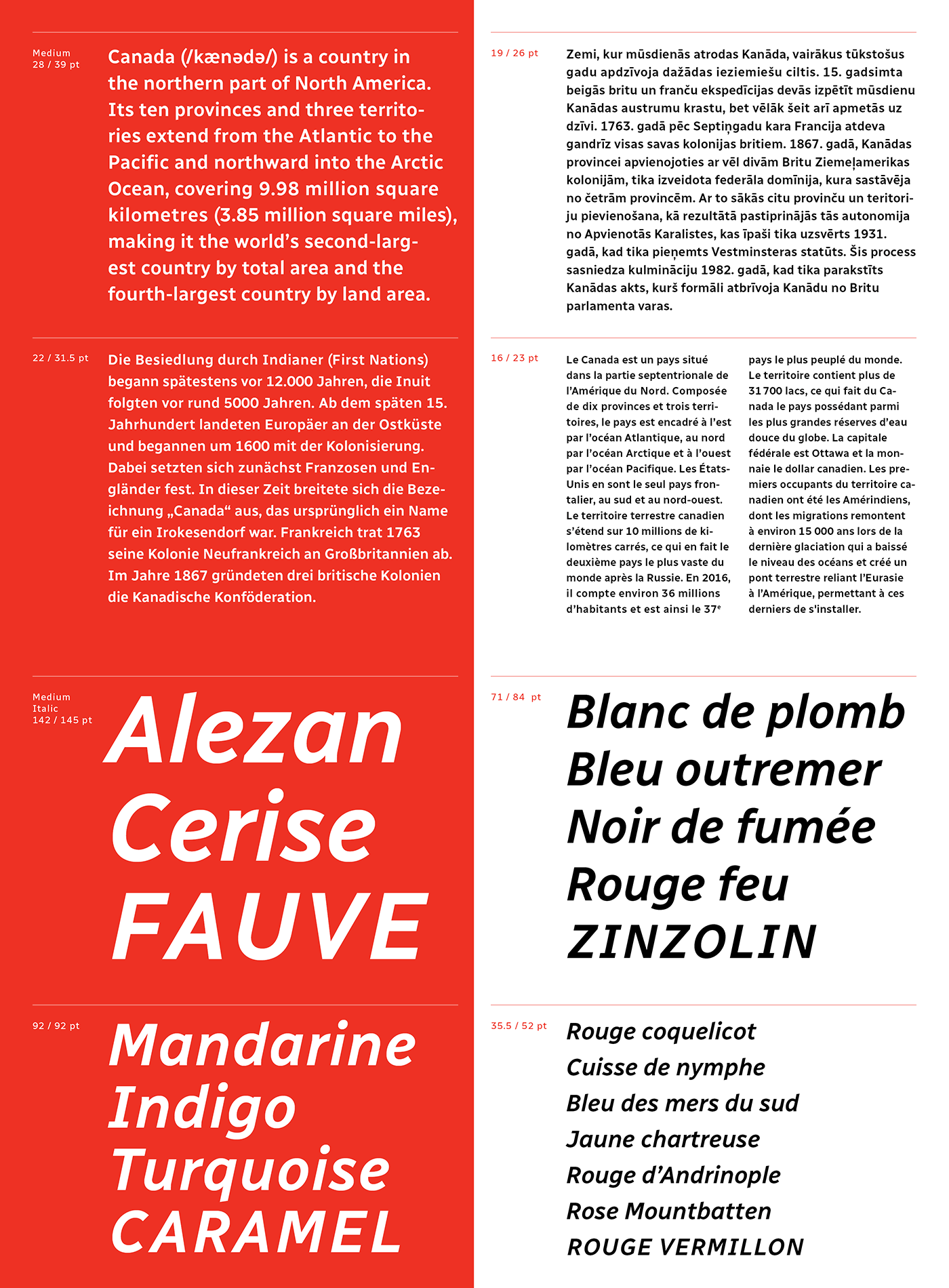
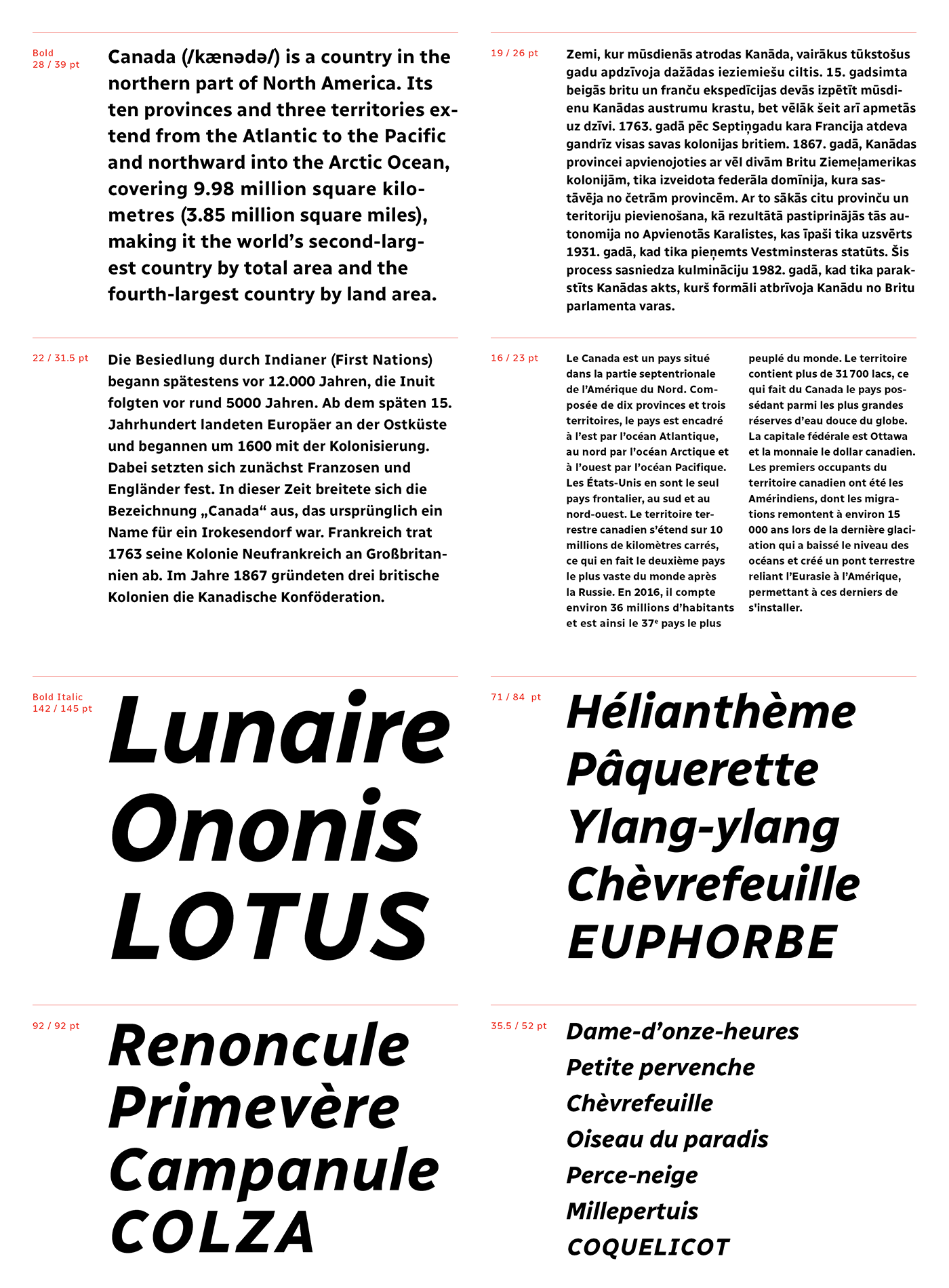
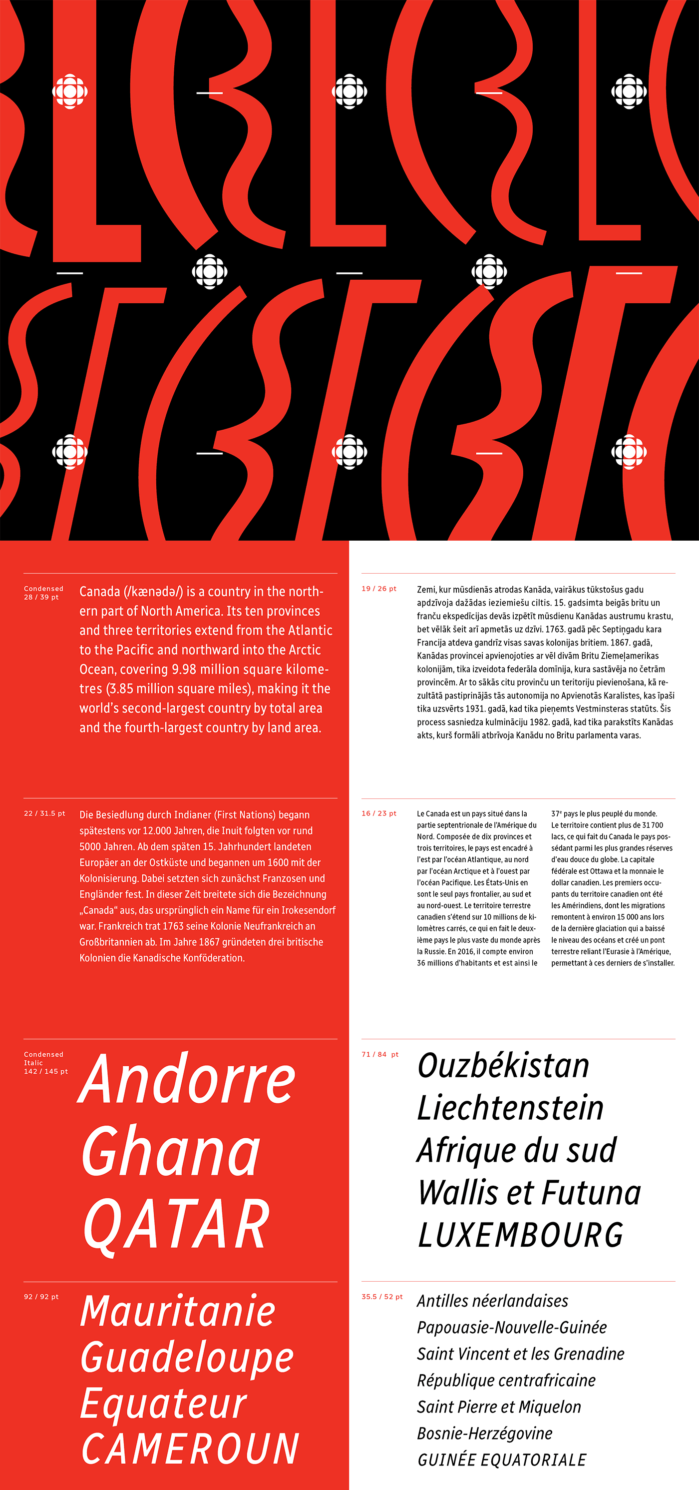
Radio-Canada is a Canadian federal Crown corporation that serves as the French national public radio and television broadcaster in Canada. In early 2017, I was mandated to design their official typeface. It was to be used across all their digital media platforms (Web, broadcast, apps, etc.). Therefore, it truly had to be a versatile and contemporary typographic solution.
With the help of Étienne Aubert Bonn at Coppers and Brasses and type designer Alexandre Saumier Demers, we created a humanist typeface that was specifically designed for superior legibility. The typeface features many subtle details such as angled descenders (p,q) and ascenders (b, d) as well as distinct serifs (I, J).
The typeface’s x height guarantees excellent readability while respecting accessibility norms. Its character set supports well over 200 languages. The Radio-Canada typeface also offers multiple OpenType features such as proportional and tabular lining as well as a few stylistic alternates (I, J, a, u) and stylistic sets.
The typefamily is currently available in the following styles: Light, Light Italic, Regular, Italic, Medium, Medium Italic, Bold, Bold Italic, Condensed Regular, Condensed Italic, Condensed Bold et Condensed Bold Italic.
This project has been selected as a winner at the 2018 Communication Arts Typography competition in the Typeface Design category.