Branding
Super Aqua Club
The project
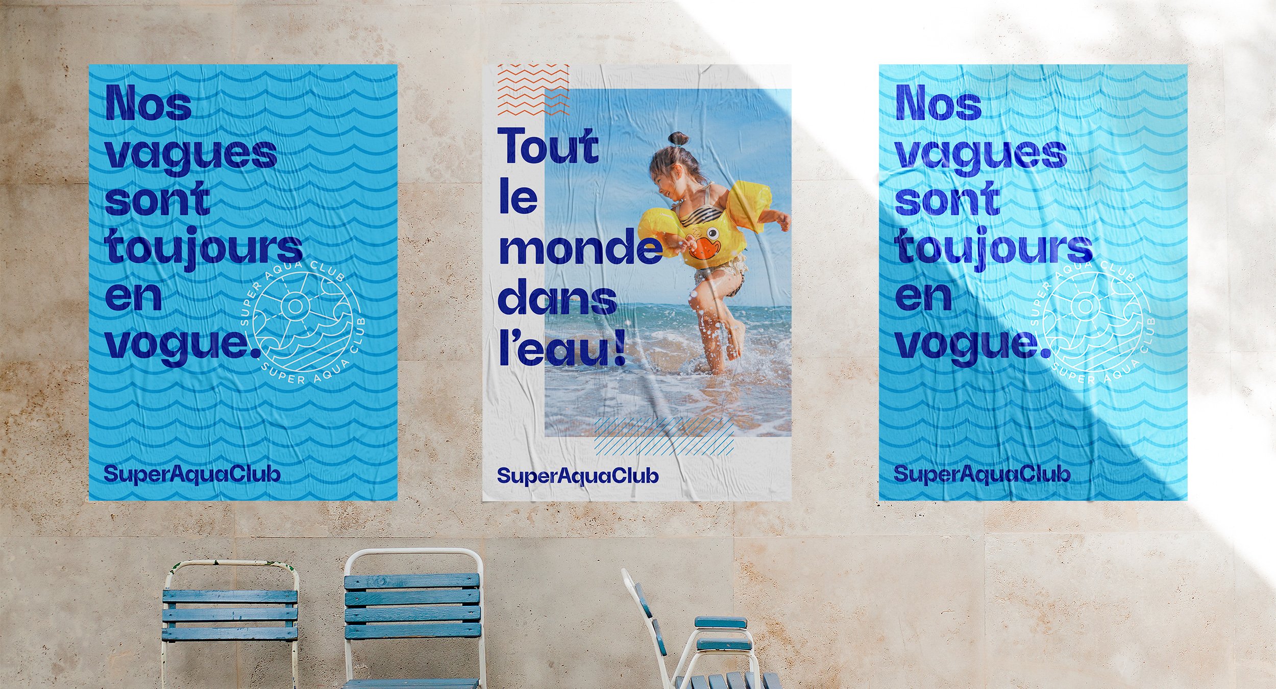
The Super Aqua Club, a Quebec institution since 1985, wanted to revisit it’s visual identity to better reflect its new brand positioning. While working on the logotype, an interesting and unexpected opportunity presented itself. Why not create waves inside the actual ink traps? In fact, we decided to go even further and designed a bespoke typeface for the client in its entirety; an invaluable brand asset. Combining custom typography, a vast new colour palette, a new photography style as well as an interesting selection of patterns, the design platform became much richer and flexible.
Credits
Creative direction
Charles Daoud
Art direction and design
Charles Daoud
Strategy
Macadam
★ IDEA finalist 2021
Super Aqua Grotesk is a display typeface born while redesigning the Super Aqua Club water park brand. The idea was to integrate the concept of water into the type by transforming some of its ink traps into waves. The resulting typeface is memorable yet legible.


