Branding
Alice Buchanan
The project
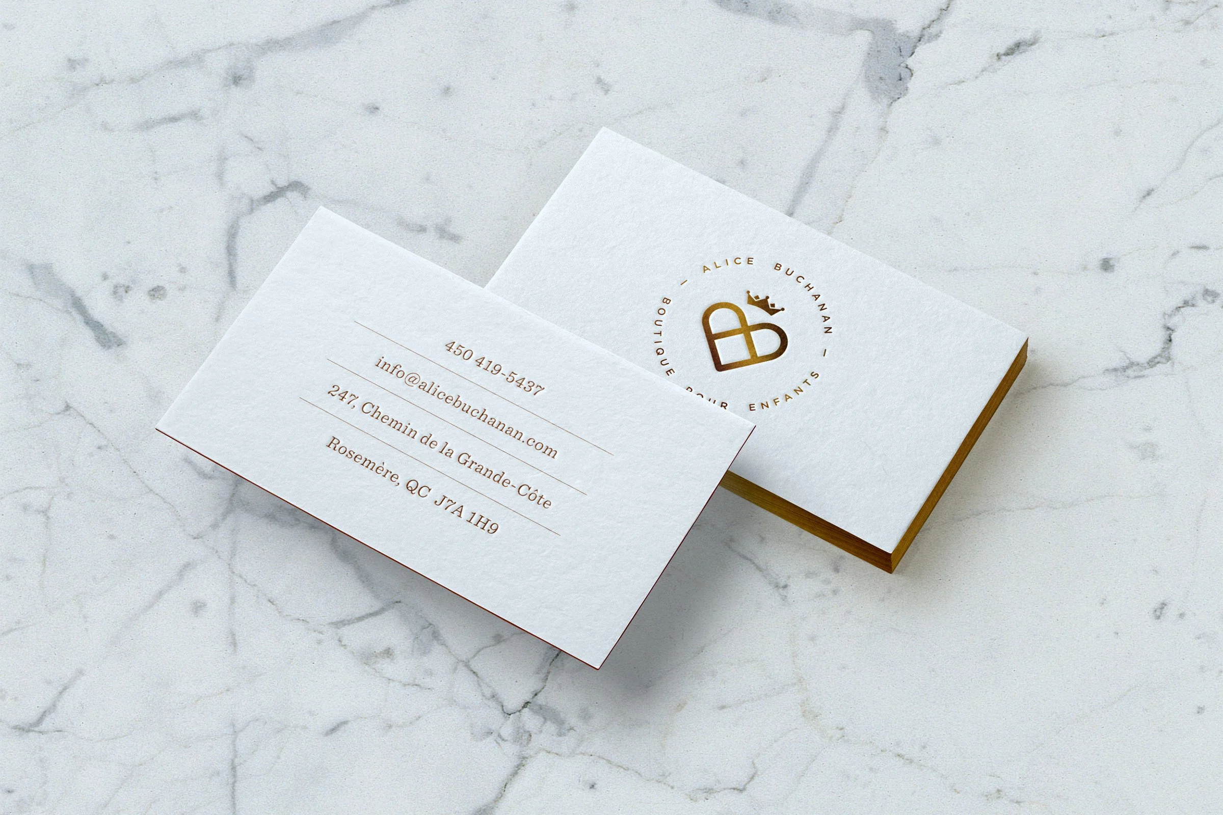
Alice Buchanan is a family owned, high-end boutique for kids ages 0 – 8. The strategy was to develop a high-end and modern identity while while balancing friendliness and class.
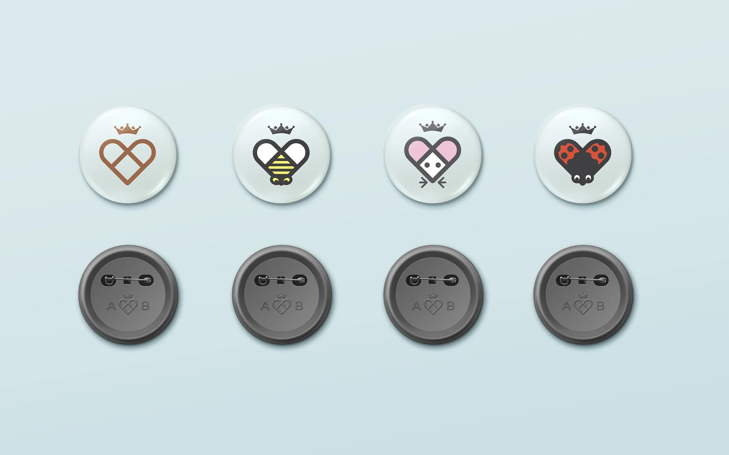
By combining the letters A and B, we were able to develop a heart symbol that represented the brand and its core values. The combination of colors, type and symbols created a rich and classy visual platform that allowed the brand to talk directly its core market; parents and grand-parents. In parallel, three friendly characters were born from the heart symbol, enabling us to also speak directly to kids whenever necessary.
Credits
Creative direction
Charles Daoud
Art direction and design
Charles Daoud
Strategy
Frederic Bédard, Charles-Vincent Trépanier


