Branding
Fondation Santé Sud de Lanaudière
The project
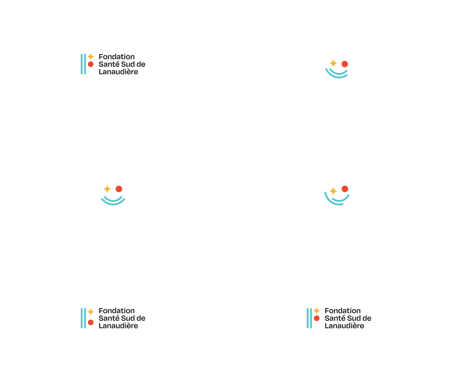
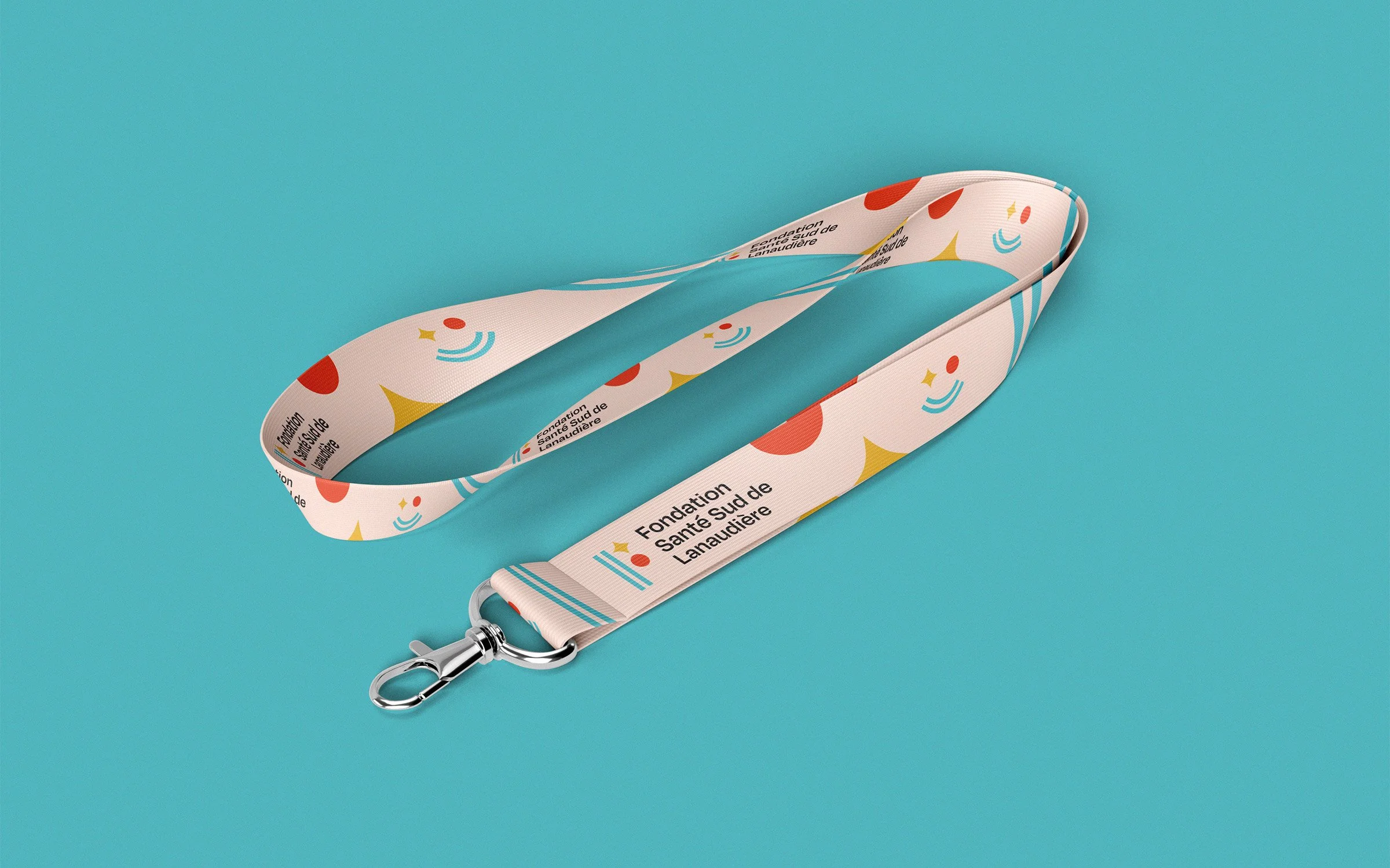
The Fondation Santé Sud de Lanaudière is a foundation closely associated with the Pierre-Le Gardeur hospital but also helps the Lanaudière South geographical area. I was approached to redesign their visual identity and make their overall visual language more coherent. Through simple shapes I illustrated their mission and values; the twin parallel lines represent the road to recovery and the omnipresent assistance of the Foundation. The star symbolizes hope and the circle illustrates their human-centric approach. Everything comes together and creates the letter F.
Credits
Creative direction
Charles Daoud
Art direction and design
Charles Daoud
Motion Design
Christine Eliass
★ Applied Arts Winner


