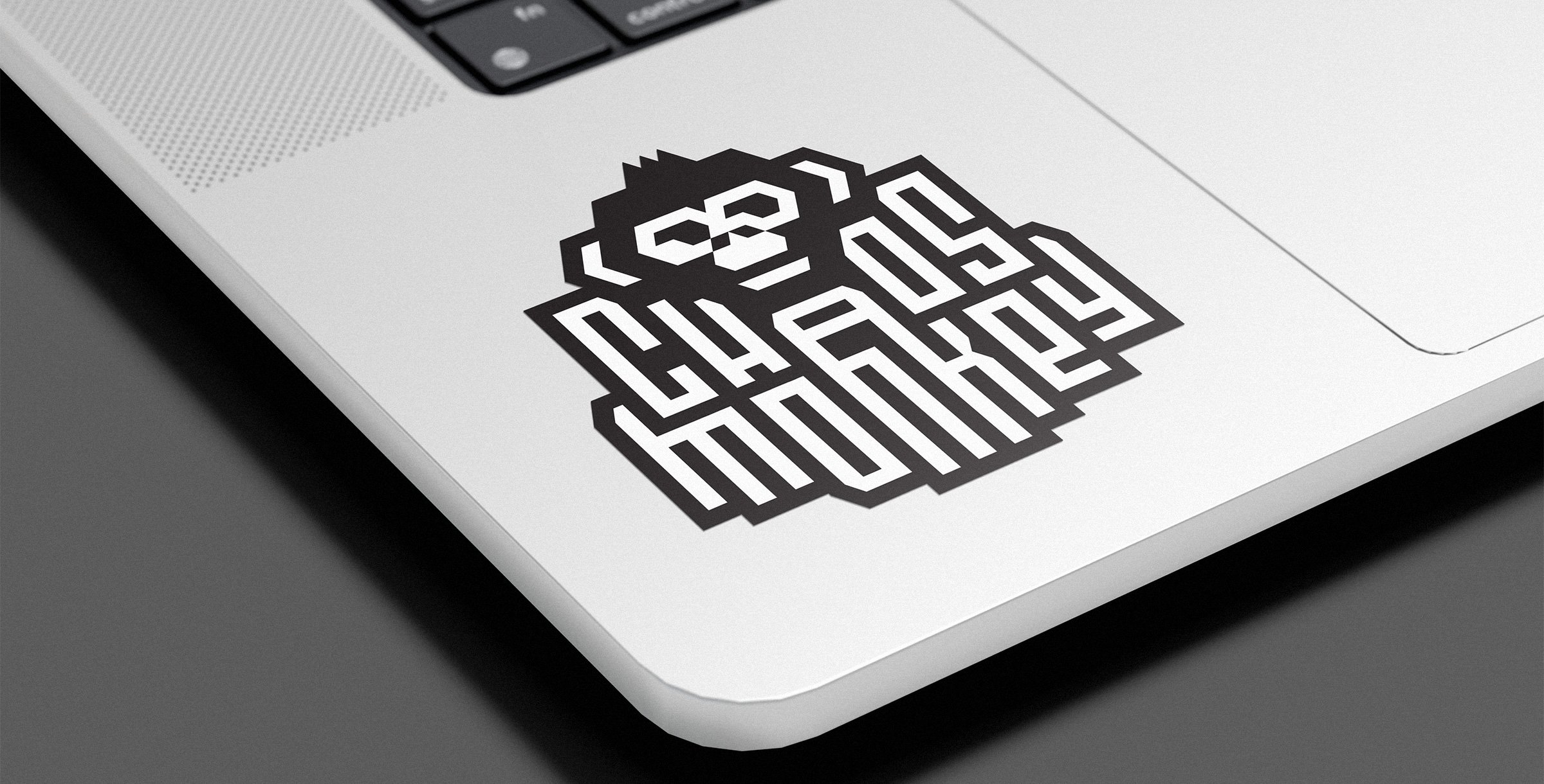
Logo design
Netflix Chaos Monkey
The project
Chaos Monkey is one of Netflix’ biggest recruiting tools for engineers, because it’s cool, popular and sophisticated. The old logo was a cartoonish illustration of a monkey and didn’t depict the project accurately. The new logo had to be smart in its execution in order to represent the nature of Chaos Monkey while looking really cool as a sticker or on a t-shirt.
Netflix runs on tens of thousands of servers. Chaos Monkey is a program that picks a handful of those servers on any given day and shuts them off during business hours without warning. This makes everything better because all the systems are built to tolerate a server crash. Whenever a server does actually crash, which is guaranteed to happen because hardware fails all the time, it’s no big deal because Chaos Monkey was built around that eventuality.
Let’s face it, it’s not every day you get to design a logo with the words Chaos and Monkey in it. Although the end result has a chaotic feel to its typography, the logo itself is very structured and based on two different grid systems. I found it to be a perfect analogy to the technology itself. The monkey’s ears are designed as brackets, a reminder of the world of software engineering.
Credits
Graphic design and Art direction
Charles Daoud


